How color theory elevates your Minecraft builds

TL;DR:
- Using intentional color palettes grounded in color theory produces more immersive and visually appealing Minecraft builds than random block choices.
- Designing effective palettes involves applying contrast, harmony, and the 60-30-10 rule, complemented by testing under different lighting and viewing distances.
- Final build success depends on adjusting color relationships for dynamic lighting and texture interactions, prioritizing in-game testing over strict adherence to real-world rules.
Most players pick blocks based on what looks "nice" in their hotbar, then wonder why their finished build feels flat or forgettable. The truth is, intentional color palettes produce dramatically better results than grabbing blocks one by one without a plan. Color theory, which is the organized study of how colors relate and interact, gives you a repeatable system for creating builds that feel polished, immersive, and visually exciting. This guide breaks down exactly how to apply those principles in Minecraft, with real examples you can use today.
Table of Contents
- What is color theory in Minecraft?
- Building better palettes: Principles and pitfalls
- Applying color theory: Real Minecraft build examples
- Texture, lighting, and distance: The missing links
- Why most color guides miss what really matters in Minecraft
- Take your Minecraft designs further with professional guides
- Frequently asked questions
Key Takeaways
| Point | Details |
|---|---|
| Palette design matters | Intentional color palettes using contrast and harmony improve Minecraft builds. |
| Mind lighting and texture | Texture and lighting can impact color choices more than many players expect. |
| Contrast prevents blending | Good contrast keeps colors distinct and avoids a muddled look from afar. |
| Test builds under conditions | Always review your palette in-game at different distances and lighting for best results. |
| Break rules for creativity | Use color theory as a base, but adapt and experiment for unique designs. |
What is color theory in Minecraft?
Color theory in the real world covers things like the color wheel, complementary hues, and emotional associations with different shades. In Minecraft, those concepts still apply, but they get filtered through the lens of block selection, biome lighting, and 16x16 pixel textures. The result is a slightly different discipline, one that rewards players who think in terms of palettes rather than individual block choices.
At its core, Minecraft color theory centers on designing palettes that deliver contrast, harmony, and visual hierarchy. Let's unpack each of those:
- Contrast is the difference in lightness or color between blocks placed next to each other. Strong contrast makes details pop. Low contrast creates calm, subtle textures. Without any contrast, a build starts to look like a single blob.
- Harmony means the blocks feel like they belong together. You want variety, but not chaos. A build using warm sandstone, terracotta, and oak wood feels cohesive. Mixing neon concrete with dark obsidian and pink wool rarely does.
- Focal points are the spots your eye naturally travels to first. A darker door frame against a light wall, or a brightly colored accent block on a roofline, draws attention exactly where you want it.
One of the most practical tools from color theory is the 60-30-10 rule. Think of your build as having three block roles. Your primary color or block family fills about 60% of the build's surface area. The secondary block fills around 30%. The accent block, which creates visual interest and draws the eye, fills just 10%. This ratio gives your build a natural, satisfying balance without requiring any complex planning.
A palette is not a list of blocks you like. A palette is a system of color relationships that work together toward a specific visual goal.
The difference between selecting a palette and selecting individual blocks is huge. When you use a palette, every block decision is filtered through one question: does this serve the system? When you pick blocks individually, every decision is isolated, and the result tends to feel disorganized no matter how good each block looks on its own.
For a deeper look at how block palettes are structured and organized, our pro block palette guide covers the full range of approaches available to builders in 2026.
Building better palettes: Principles and pitfalls
With the basics in mind, let's dig into crafting palettes and sidestep common issues.
The first step in building a good palette is picking a theme. Your theme drives color mood. A medieval castle might lean on gray stone, dark oak, and subtle mossy green accents. A tropical resort calls for white concrete, warm wood, and vivid coral or lime green. A futuristic base works with black, gray, and electric blue or cyan accents. Each of these themes has a natural primary, secondary, and accent relationship baked in.
The palette methodology goes beyond just choosing colors you like; it requires thinking about block roles, visual hierarchy, and how contrast will read across different viewing distances. This is where a lot of builders run into trouble.

The muddy blob problem is one of the most common pitfalls in Minecraft building. It happens when you use multiple blocks that are close in color and similar in texture. From a few blocks away they look distinct. From 50 blocks away they merge into an undifferentiated wall. You lose all the detail you worked hard to place. The fix is making sure at least one of your three palette roles has a noticeably different value (lightness or darkness) than the others.
Here is a useful comparison of palette types and what they tend to produce:
| Palette type | Visual effect | Best use case | Common mistake |
|---|---|---|---|
| Monochromatic | Calm, refined, subtle | Minimalist or modern builds | Too little contrast, looks flat |
| Complementary | Bold, energetic, dramatic | Fantasy, accent features | Overusing both colors equally |
| Triadic | Vibrant, playful, dynamic | Creative or abstract builds | Colors clash without a clear primary |
| Analogous | Warm, natural, cohesive | Nature, organic structures | Blends together at distance |
Understanding which palette type serves your build helps you make faster decisions and avoid wasted materials. If you want to go deep on a single-color approach, check out our guide on monochromatic palettes. For high-contrast builds with opposing colors, our complementary palettes guide is a strong resource. And if you want the liveliest builds possible, the triadic palettes tutorial walks you through making three-color systems work beautifully.
Texture matters as much as color. Two blocks can share nearly the same hue but have very different textures, and that texture difference creates visual separation even when the color difference is small. Smooth stone and cobblestone are both gray, but their textures keep them visually distinct. Ignoring texture and relying purely on color can leave your palette feeling thin.
Common errors builders make with palettes:
- Using three shades of the same color without varying the texture
- Placing accent blocks in a random scatter rather than at intentional focal points
- Mixing warm and cool tones without a clear plan, creating visual tension that feels accidental
- Forgetting to test the palette from a distance before committing to a large build
- Treating all blocks as equal rather than assigning clear primary, secondary, and accent roles
Pro Tip: Before starting any large build, lay down a flat test area using all three palette blocks in the 60-30-10 ratio. Walk back 50 to 100 blocks and look at it. If you can still clearly read three distinct zones, your contrast is strong enough. If it all blurs together, you need to adjust one of your block choices before you start.
Applying color theory: Real Minecraft build examples
Understanding the theory is one thing. Seeing it in action is even more powerful.
Let's walk through three palette-driven build scenarios that demonstrate how color theory plays out in practice. Block palettes are most impactful when color, texture, and viewing distance are all considered together, not as separate concerns.
Scenario 1: Monochromatic stone fortress
The primary block is polished deepslate, filling about 60% of all walls. The secondary block is deepslate tiles at roughly 30%, used for trim, towers, and rooflines. The accent at 10% is polished blackstone, used only on window frames, gate supports, and wall caps.
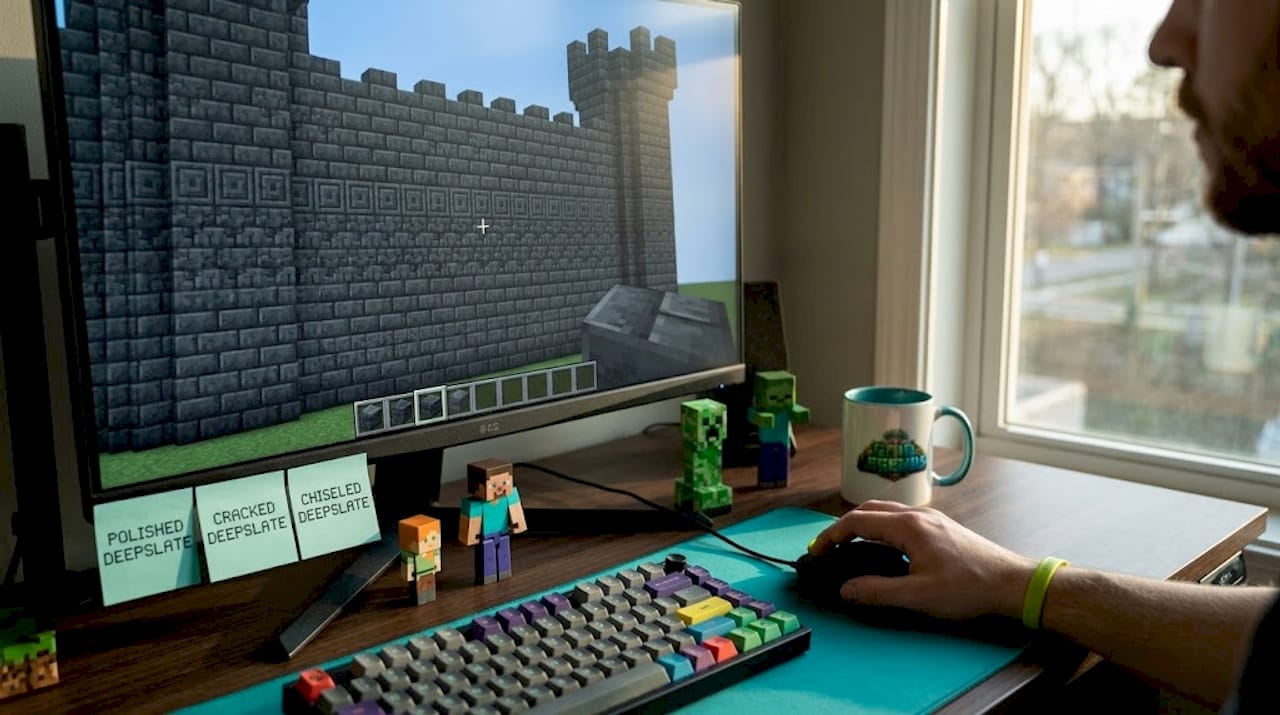
The result is a build that reads as unified and powerful. The subtle texture differences between the three deepslate variants create visual depth without breaking the dark, imposing mood. From a distance, you read "dark fortress." Up close, you see the layered detail.
Scenario 2: Complementary desert outpost
Primary block is smooth sandstone at 60%, filling exterior walls and flooring. Secondary is terracotta (specifically orange or red) at 30%, used for roof tiles, pillars, and interior walls. Accent at 10% is teal or cyan concrete, used for banners, window panes, and decorative inlays.
The orange and teal relationship is classically complementary. They sit opposite each other on a color wheel, creating maximum visual energy without feeling chaotic, because one color dominates and the other only appears as an accent. The warm sandstone base grounds everything.
Scenario 3: Triadic forest shrine
Primary is spruce wood and planks at 60%. Secondary is mossy cobblestone at 30%. Accent is amber-colored blocks like yellow terracotta or honeycomb blocks at 10%, placed on altar tops and trim.
The earthy brown, natural gray-green, and warm amber form a triadic-inspired grouping. The build communicates "ancient nature" immediately, even from far away. Each color earns its place.
How light levels shift your palette
This is where things get really interesting. Minecraft's lighting system actively changes how colors look. A block placed in full daylight reads differently than the same block placed in a shadowed interior or lit only by torchlight.

| Condition | Visual effect on palette | Adjustment tip |
|---|---|---|
| Full daylight | Colors appear brighter, contrast reduces | Use darker accents to maintain contrast |
| Shade or shadow | Colors deepen, darken noticeably | Lighter secondaries help balance |
| Torchlight | Adds warm orange tint to everything | Avoid warm-heavy palettes near torches |
| Night / moonlight | Mutes all colors toward neutral | High-contrast builds maintain clarity |
Light in Minecraft does not just change brightness. It changes the perceived hue of your blocks. Torchlight casts an orange warmth that can make warm-toned blocks look very similar to each other and make cool-toned blocks look muddy. Running tests at night or in enclosed spaces before finalizing your palette choices is something most builders skip, and it costs them.
For more inspiration on how palettes translate to finished buildings, our palette build examples page and the color harmony for houses guide both show these principles applied to full-scale structures.
Texture, lighting, and distance: The missing links
Palettes aren't just about hue. Let's look at what most guides overlook: texture, lighting, and viewing context.
Texture and lighting influence how colors interact in builds, sometimes more dramatically than the actual color choice itself. Two blocks with nearly identical hues but different surface patterns will still read as distinct. But two blocks with very similar hues and similar textures will merge visually, especially at a distance. This distinction changes how you should approach every palette decision.
The block you pick for its color up close might completely disappear into the wall around it from 30 blocks away. Always design for the viewing distance where your build will most often be seen.
Step-by-step process for texture-aware palette building:
- Start with color range. Pick your three palette blocks and confirm they have clear light, mid, and dark values. Do not let all three sit in the same brightness band.
- Check texture variety. Look at each block's surface. You want at least one smooth block, one rough or detailed block, and ideally one with directional grain or pattern, such as wood or chiseled stone.
- Build a small sample wall. A 10x10 section using all three blocks in their intended ratio tells you a lot about how they will feel at scale.
- Test at multiple distances. Walk 10, 30, 60, and 100 blocks away from your sample. At 100 blocks, can you still see clear separation between the three block zones? If not, your contrast or texture variety needs adjusting.
- Test under different lighting. View your sample in full sun, in shade, and next to light sources like torches, lanterns, and glowstone. The color shift may surprise you and change your decision.
- Adjust one variable at a time. If the palette looks wrong, change only the secondary or only the accent block. Changing two at once makes it hard to know what fixed the problem.
For builds that rely heavily on natural, flowing color transitions, our guide on analogous palettes is the right starting point. Analogous palettes use blocks that sit close together in the color family, which creates harmony but demands strong texture contrast to avoid the muddy blob effect at distance.
Biome lighting is a factor, too. The Nether casts everything in reddish-orange ambiance. The End has a pale, colorless light. Underwater light flickers blue-green. These environment-level changes mean a palette that looks incredible overworld might fall flat in a Nether build. Build within the biome's existing light language, or use your palette deliberately to contrast it.
Pro Tip: The soul sand valley biome in the Nether has that distinctive blue fog. If you build with cool-toned blocks like blue terracotta or prismarine there, they blend into the environment. If you want a structure that stands out dramatically, use warm terracotta, red nether brick, and orange accents to cut through the blue atmosphere.
Why most color guides miss what really matters in Minecraft
After running a 200-player SMP server and reviewing hundreds of player builds, we've noticed something consistent. Most beginner and intermediate builders who read color guides come back with technically correct palettes that still look a bit off in-game. Why? Because most guides teach color as if Minecraft renders like a painting. It does not.
Standard color theory assumes lighting is consistent and surfaces are flat. In Minecraft, lighting changes by the second as the sun moves, shadows fall differently on each face of a block, and your "flat surface" is actually a mosaic of 16x16 textures that each read slightly differently at scale. Following a color wheel strictly without adapting for texture and context produces results that feel stiff or just slightly wrong, even if you technically followed the rules.
The builders on our server who produce the most impressive work do something different. They break the rules intentionally. They might use a warm accent where the color wheel says cool. They might use four blocks instead of three. They pick blocks that feel right after testing, not just blocks that theoretically qualify as complementary or analogous.
The lesson we keep coming back to is this: color theory gives you a starting point and a vocabulary. It helps you diagnose why a build looks wrong. But the final arbiter is always how it looks in-game, under real lighting, at real viewing distances. Visit our creative palette inspiration page to see examples of builders who found that balance beautifully.
There is also a tendency to treat "more blocks = more interesting," and that is genuinely false. Some of the most striking builds we have seen on our server used only two block types and absolutely nailed contrast and texture. Simplicity with intention always beats complexity without a plan. Trust the system, but trust your eyes more.
Take your Minecraft designs further with professional guides
Ready to build with confidence? You've got the color theory foundation, and now it's time to put it into practice with structured resources that go even deeper. Whether you're starting with your first intentional palette or you're ready to tackle advanced triadic builds, having a clear guide makes the process faster and more rewarding.
At Gaia Legends, we publish five detailed Minecraft guides every day covering everything from block palettes to boss fights to server strategy. Our palette-focused content is built on real building experience and grounded in Minecraft Wiki data, so every recommendation works in actual gameplay. Explore our full library of color and design guides at guides.gaialegends.pro and take your builds from "pretty good" to genuinely impressive. Your next great build is one palette away.
Frequently asked questions
How does Minecraft's lighting affect color palettes?
Lighting and texture can dramatically change how block colors appear in-game, sometimes making similar colors completely indistinguishable or shifting the perceived hue of entire walls. Always test your palette under the specific light conditions of your build location before committing.
What is the 60-30-10 rule in Minecraft building?
The 60-30-10 palette rule means using 60% primary color blocks, 30% secondary, and 10% accent blocks to achieve a balanced, visually appealing design without visual chaos. It is the easiest framework for beginners to start building polished-looking structures immediately.
Why do some color palettes look great up close but blend together from afar?
Similar colors merge visually at distance when both color and texture are too close to each other, creating a muddy, undefined effect. Adding clear contrast in either brightness or texture prevents this from happening at typical viewing distances.
Can you use real-world color theory rules in Minecraft builds?
Real-world color rules are a solid starting point, but you must adapt for texture and lighting to get results that look great in actual Minecraft gameplay rather than just theoretically correct on paper.
What's a quick way to test a block palette before building?
Build a small 10x10 sample wall in-game, then view it at varied distances and under different lighting conditions, including shade, torchlight, and full daylight, to confirm that contrast and cohesion hold up across all contexts.
Recommended
Frequently Asked Questions
Discussion
Join the Discussion
Start at Seeker — climb to Legend through the ranks
Every comment earns you progress. Reach new ranks to unlock mystery box rewards on the Gaia Legends server. The more you share, the higher you climb.
No comments yet
Be the first to share your thoughts and earn your Seeker rank.